
01 / SERVICE
Brand Identity / Packaging Design
02 / CLIENT
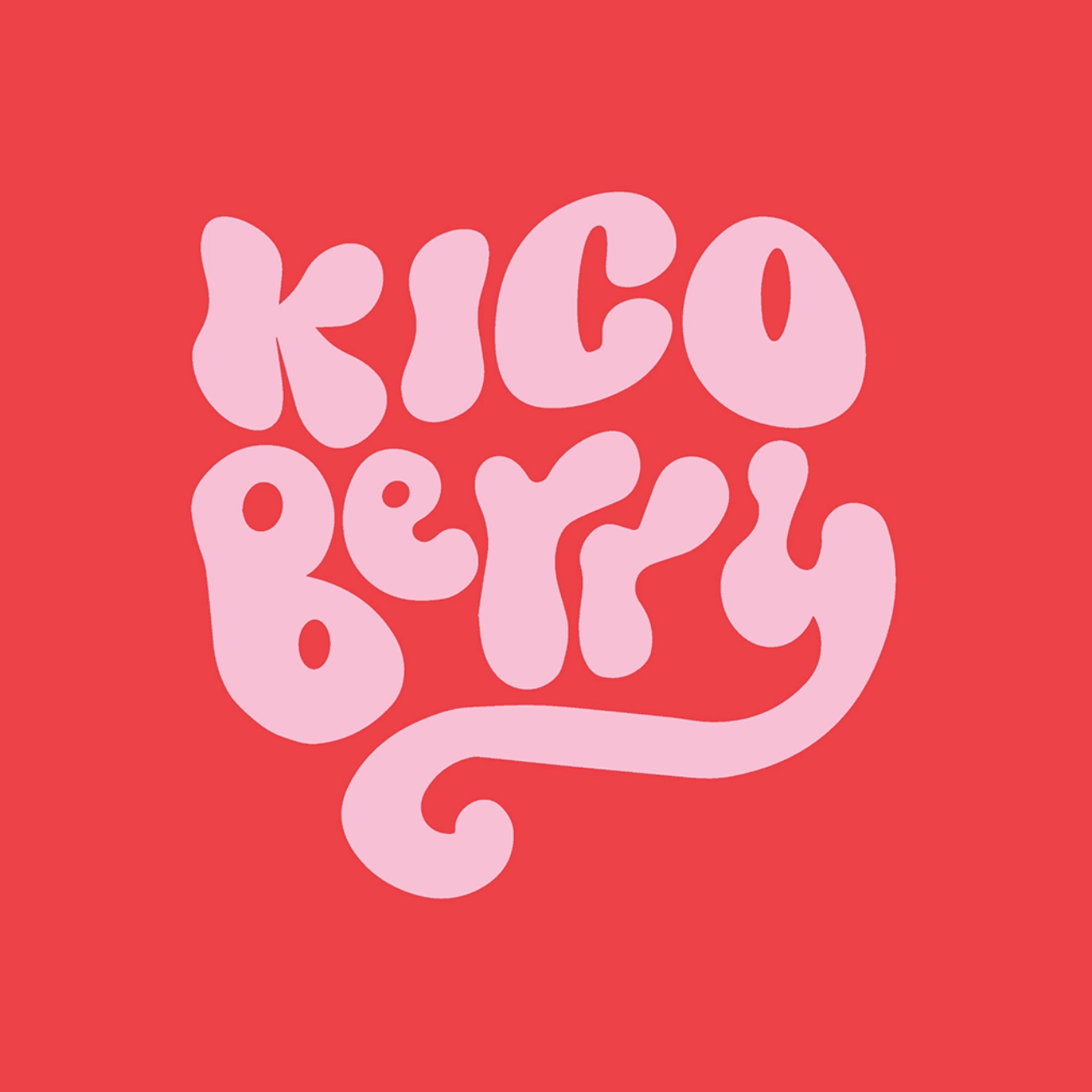
Kico Berry
03 / Industry
FMCG
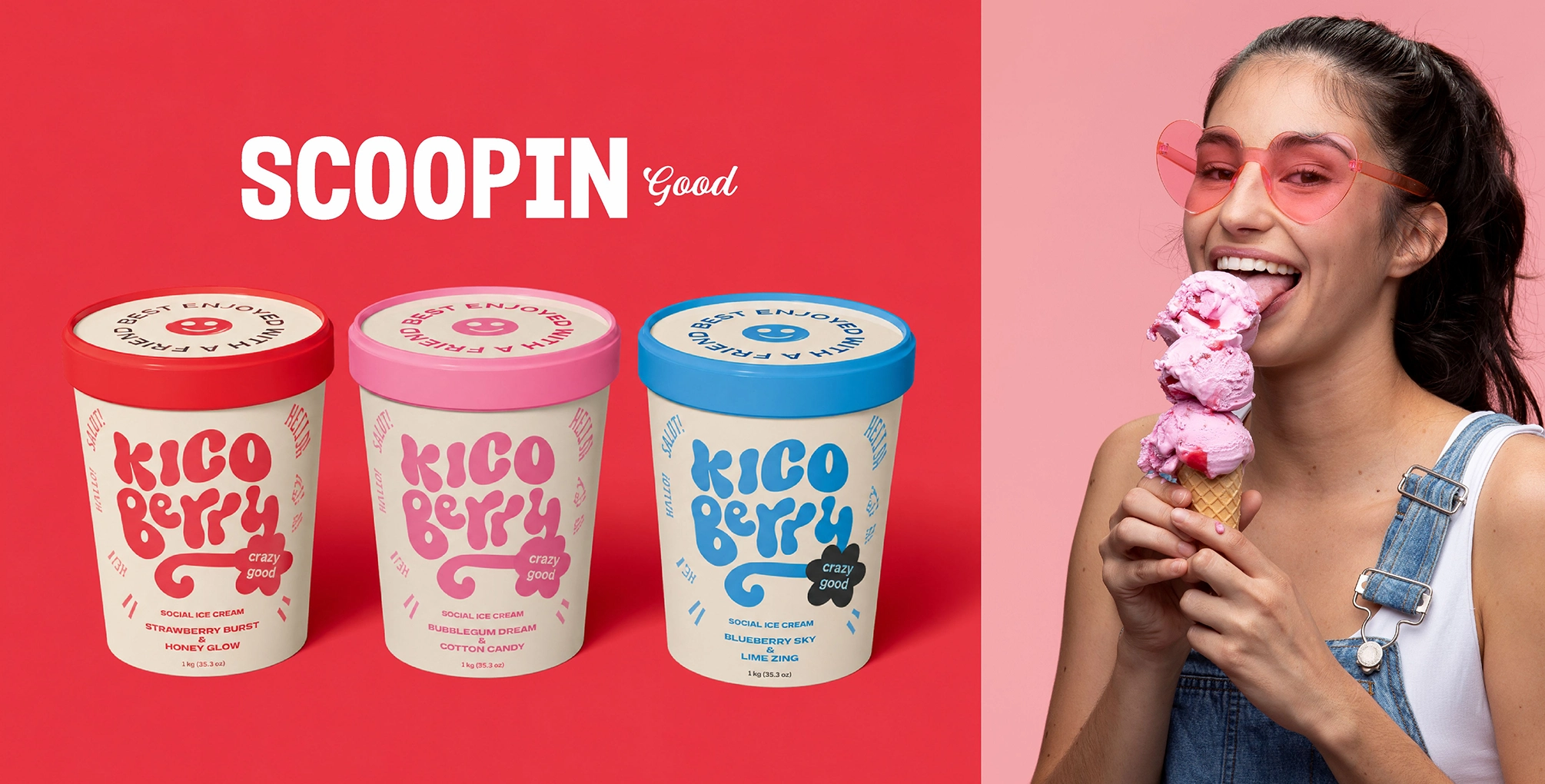
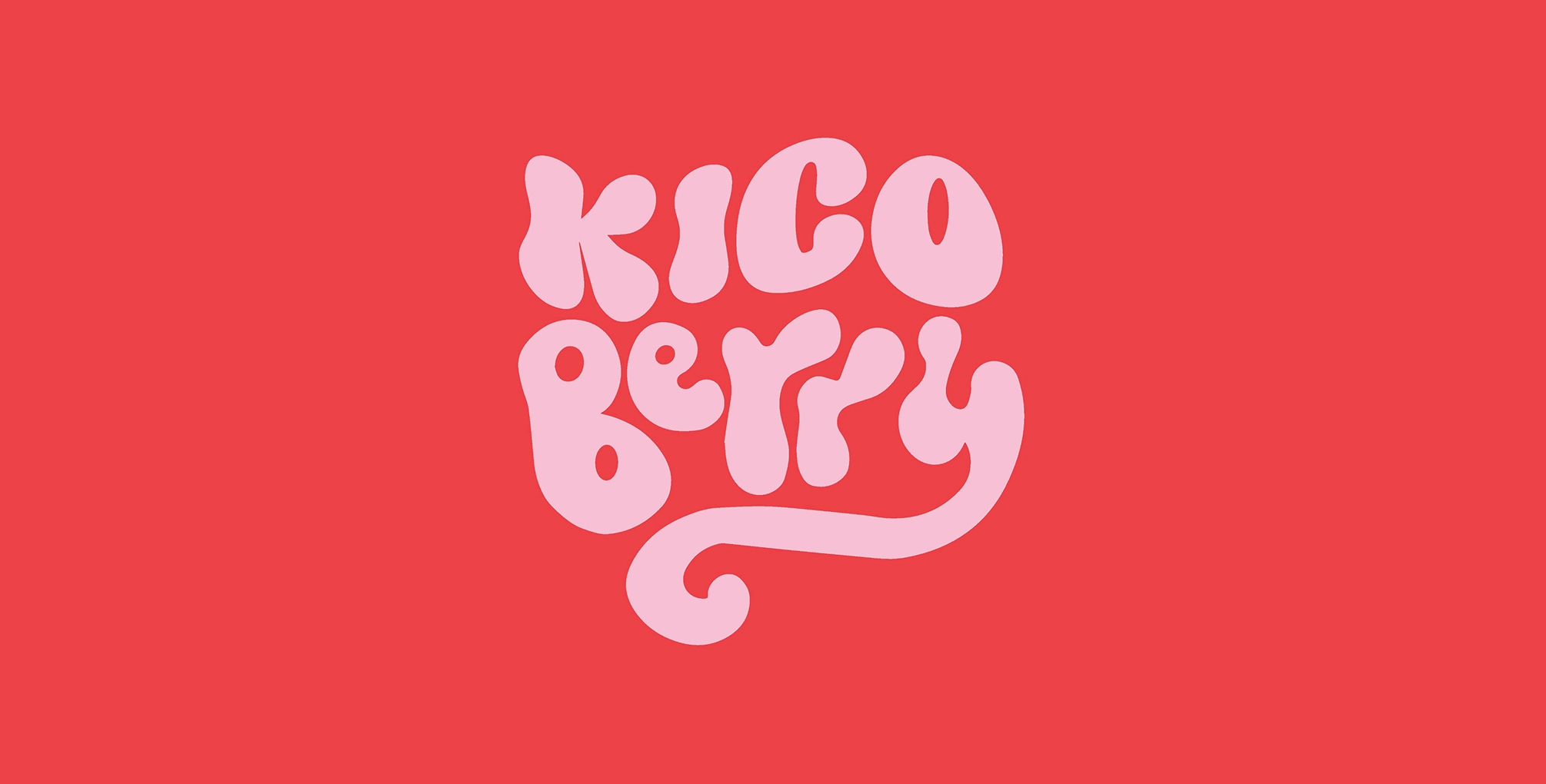
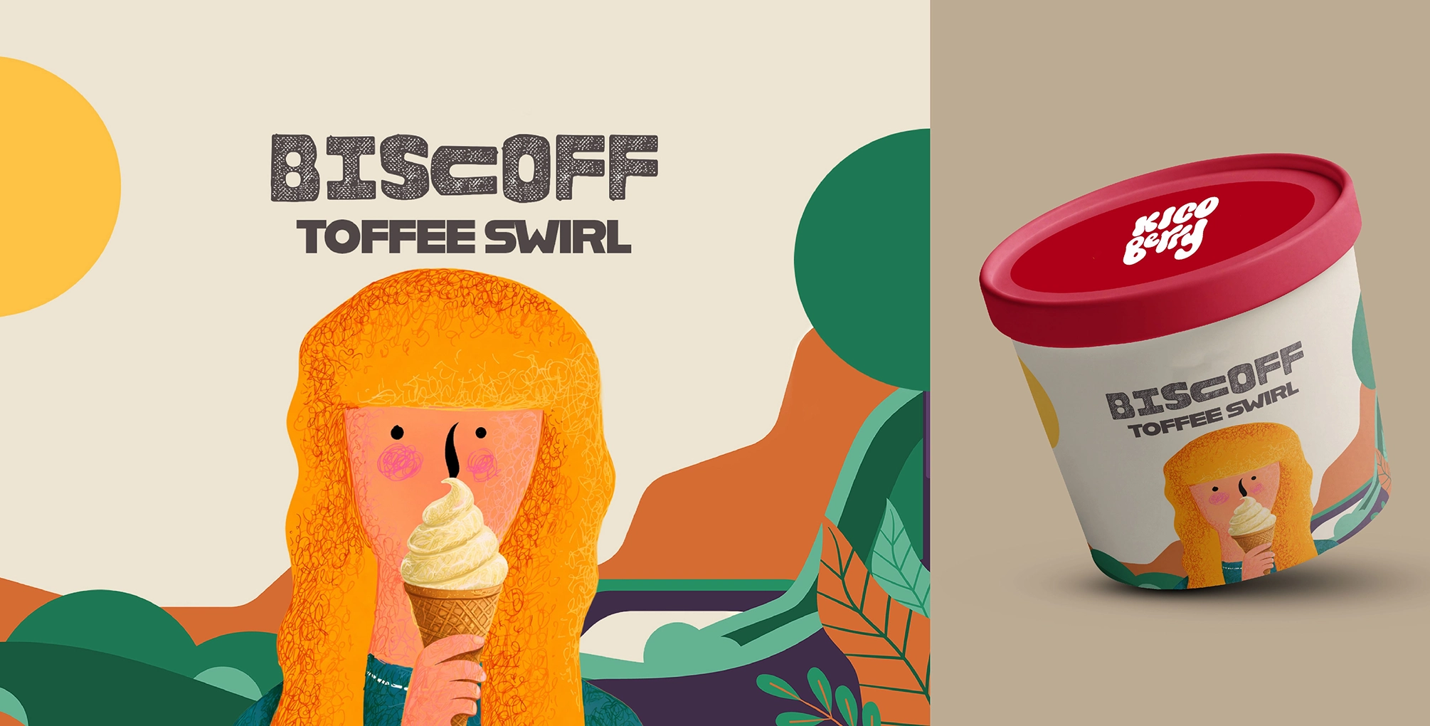
Looks That Deserved a Double Scoop
In a category driven heavily by impulse, visual appeal matters just as much as the product itself. Kico Berry needed a brand identity that could instantly communicate freshness, fun and flavour, while standing confidently within a crowded ice cream market.
That’s where we in. From shaping the brand identity to designing the packaging system, we crafted a visual language that felt vibrant, playful and instantly recognisable. The objective was simple, to make Kico Berry look just as exciting as the experience waiting inside the pack. Every design decision was built to capture attention quickly, create recall effortlessly and give the brand a personality that felt fresh, flavourful and hard to miss.
02 / Objective
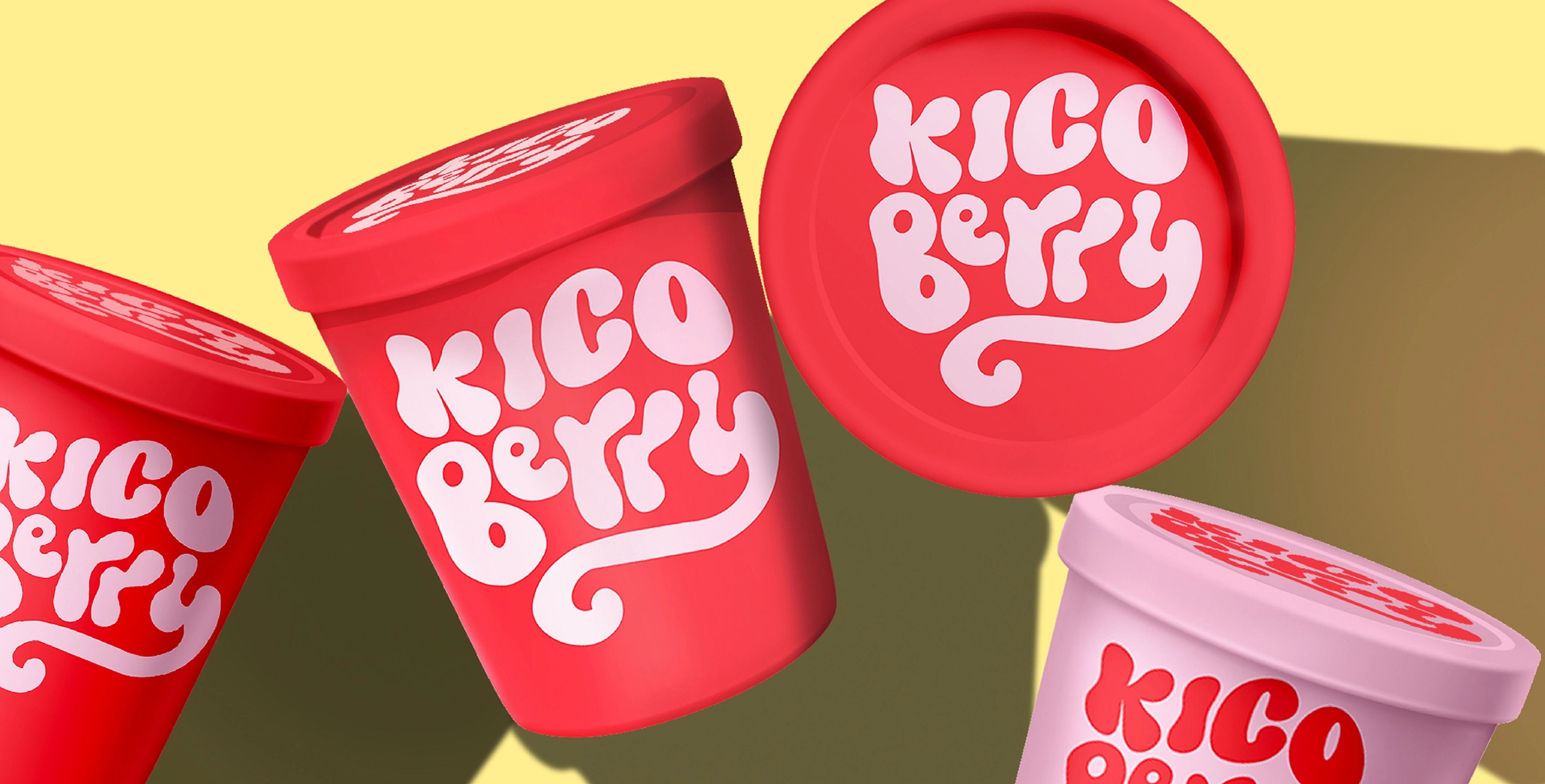
Adding Flavours To Their Visual Identity
We sculpted a vibrant visual identity for Kico Berry, designed to command instant shelf presence through high-impact, flavour-forward aesthetics. By blending modern design with a playful, spirited energy, we ensured the brand’s freshness was palpable at every touchpoint. This cohesive strategy transformed packaging into a powerful storytelling tool, creating unmissable visual recall and establishing Kico Berry as a contemporary favorite that tastes as bold as it looks.
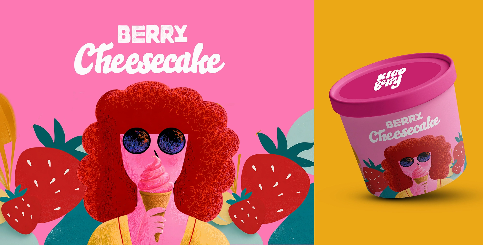
03 / Major Touchpoints
Visual Scoop in the Making
The visual essence of Kico Berry was brought to life through a deliberate fusion of identity and architecture. We began by sculpting a bold brand identity that serves as the heartbeat of the label, radiating energy and modern charm. This was seamlessly translated into innovative package design, where vibrant color palettes and ergonomic forms converge to create a sensory experience. Every detail was meticulously engineered to bridge the gap between aesthetic appeal and functional shelf-dominance, turning a simple scoop into a visual masterpiece.
04 / Result
A Brand Presence That Felt Instantly Fresh
Kico Berry emerged with an identity that radiates energy, securing its place as an instantly memorable contender in a crowded market. By harmonizing a bright, playful design language with flavor-forward communication, we ensured the brand commanded a distinctive shelf presence. This cohesive system bridges the gap between aesthetic appeal and sensory invitation, proving that when packaging is as exhilarating as the product itself, the visual experience becomes a powerful catalyst for consumer connection.