



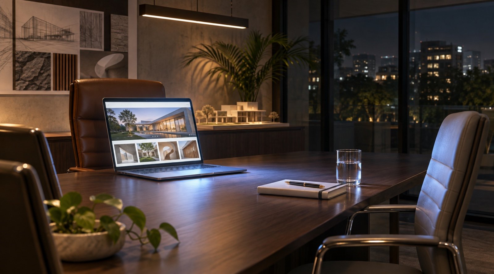
It’s 10:46 p.m. A founder opens three tabs.
One is your website. The other two belong to competitors.

She has a project to brief on Monday and wants to know who’s worth calling. Your homepage opens with a handsome animation and the words “Redefining what’s possible.”
She gives it another scroll.
Then she switches tabs.
The next site shows her a project similar to hers, explains how the engagement worked and tells her who she’ll speak to if she gets in touch.
One tab stays open.
This is what using your website as a sales tool looks like in practice. Long before your team gets a chance to pitch, a potential customer is already deciding whether to put you on the shortlist.
What would your best salesperson say?
Imagine a prospect asks, “Have you worked with a business like ours before?”
Your best salesperson probably has a story ready. They can name the challenge, explain what your team did and tell the prospect what happened next. On the website, that same answer often gets reduced to a row of logos under Trusted By.
The logos establish familiarity. The story answers the question.
Start your website strategy for business growth by sitting in on a few sales calls. Write down the questions people ask before they’re comfortable moving forward. Do you work with companies our size? What does a typical engagement involve? Can we see something similar you’ve done? Those questions are a better brief for business website development than a sitemap copied over from the old site.
A useful brand website strategy puts the answers where people naturally look for them. Someone reading a service page should be able to see a relevant example of the work right there, while they’re still thinking about whether it fits their brief.
The brochure move is to say it. The website’s move is to prove it.
Take a line like “We understand real estate.” It sounds fine until you see it on five agency websites in a row.
Now imagine clicking through to a campaign and seeing the original brief. The developer needed to explain a premium price in a neighbourhood where buyers were comparing projects on square footage alone. The case study shows how the agency reframed the conversation, what went on the hoarding and how the landing page carried that idea forward.
Suddenly, you can picture what it might be like to work with that team.
That’s where website design for business growth gets interesting. A good layout can bring a decision, a piece of work and its context together on one screen. Visitors get to see how you think while they’re deciding whether to trust you with their own brief.
“Contact Us” asks the visitor to do a lot of guessing
Will I get a sales call? Do I need a finished brief? Can I ask about budgets first?
A button can be easy to spot and still leave people unsure about clicking it. Conversion-focused website design makes the next step feel specific to the page. Someone reading a case study might respond to Discuss a Similar Project. Someone weighing up two services might prefer Talk Through Your Brief.
Follow that click yourself, on your phone. Can you complete the form without looking up information? Does it ask for a company address before it asks what you need? When you hit submit, does the confirmation tell you what happens next?
That five-minute exercise can give a lead generation website design brief more direction than a long list of features. It also makes website user experience optimization tangible. You can feel exactly where a straightforward enquiry starts to feel like work.
Your campaign made a promise. The next page should pick it up.
Say you run a campaign for a new residential launch. The ad talks about larger homes for growing families. Someone clicks because that’s exactly what they’re looking for. The page opens with a welcome message from the developer and a menu of projects.
Now they have to find the thing they just clicked on.
A good digital branding strategy makes that handoff feel like one conversation. The landing page picks up the promise from the ad, shows the floor plans, explains what the extra space means in daily life and gives the buyer a way to book a visit.
When building a digital marketing strategy for businesses that spend on search or social, open the ad and landing page side by side. Read them in order. Does the first screen of the page answer the question the ad just put in someone’s head?
Ask sales which enquiries were worth a second call
Your dashboard says the website generated 40 enquiries. Your sales team says four were a good fit. Both numbers belong in the same conversation.
Start website conversion optimization by looking at which pages bring in people with the right needs, timelines or budgets. Then check what those pages tell visitors before they get in touch. You may find that one service page sets expectations clearly, while another leaves the sales team explaining the basics from scratch.
That gives you something concrete to test. Add a relevant case study. Explain who the service is designed for. Make the first step clearer. Then see whether the conversations improve.
How House of Hues approaches a website brief
At House of Hues, one of our first questions is, “What do people need to believe before they’re ready to buy from you?” The answer shapes what we write, what we show and where we ask someone to take action.
If you’re considering a website design company in Pune or a website design company in Mumbai, bring one real customer question to the first meeting. Ask where it belongs on your site and how they’d answer it. You’ll get a feel for how the team thinks before you see a single homepage concept.
Have a page you wish did a better job of explaining what you offer? Bring it to the House of Hues. We can start there.
Frequently Asked Questions
-
What should a business website homepage say first?
Explain what you do, who you help and where visitors should go next. Use the words a customer would use to describe what they’re looking for.
-
How do I choose a website development agency in Pune or Mumbai?
Ask any website development agency in Pune or website development agency in Mumbai to walk you through a live project and explain how customer needs shaped its content, navigation and enquiry process.
-
Do I need a full redesign to get more website enquiries?
Start with the pages visitors already use. Test clearer service descriptions, better-placed case studies or a simpler enquiry form before deciding how much needs to change.
-
What makes a landing page work better for a campaign?
It picks up the offer from the ad, answers the questions people are likely to have and gives them a clear way to respond.
-
How do I know if my website is helping sales?
Track which pages generate enquiries, then ask your sales team which of those enquiries turn into qualified conversations or proposals.
House of Hues is where strategy, storytelling and standout creativity come together. We help brands build personalities people connect with and identities they remember.
You may also like

The Rise of Branded Residences: When Luxury Real Estate Meets Global Brands

The Difference Between Content That Gets Views and Content That Gets Remembered

Can PR Build Brand Equity Better Than Advertising?

Celebrity Endorsement for Real Estate: When Does It Make Strategic Sense?